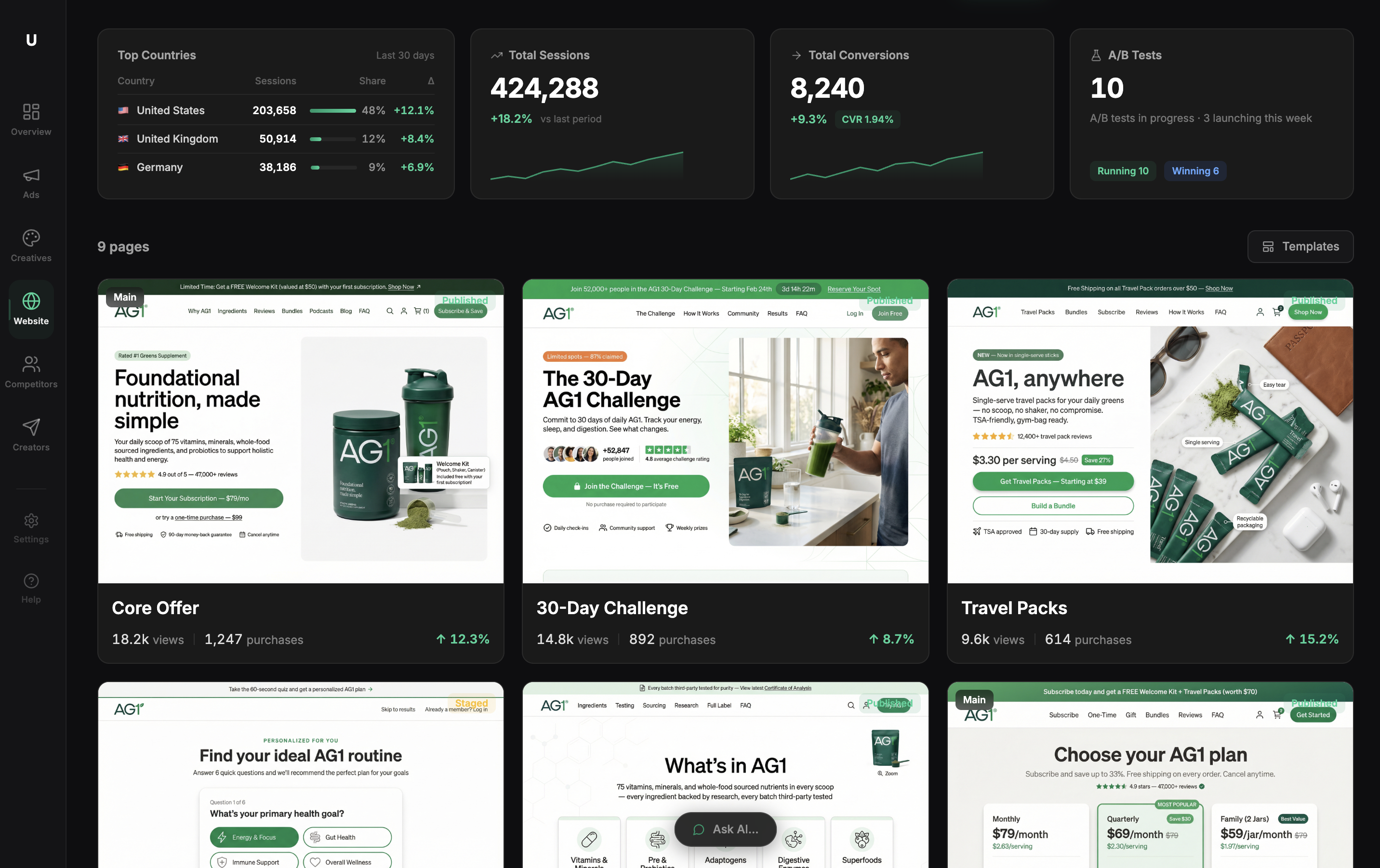
Ecommerce Landing Pages: The Anatomy of Pages That Actually Convert
Why Most Ecommerce Landing Pages Fail Before the First Scroll
Most ecommerce landing pages fail because of structural sequencing errors, not product quality or ad spend. According to Unbounce's industry benchmarks, the average ecommerce landing page converts at 2-4% — and most DTC brands sit at the low end of that range.
A landing page isn't a collection of sections you can arrange by gut feeling. It's a sequence of decisions your visitor makes, one after the other. Get the sequence wrong and you lose them at step two — even if step five is flawlessly designed.
This post breaks down the five structural zones where conversions are won or lost on ecommerce landing pages: the above-the-fold contract, the credibility stack, the objection gauntlet, the CTA architecture, and the attribution layer. Fix these in order, and you'll have a page that compounds. Skip one and the others can't save you.
Zone 1 — The Above-the-Fold Contract (Headline + Hero)
Your headline has exactly one job: confirm the visitor is in the right place, and give them a reason to keep reading.
Most ecommerce headlines fail that job. "Elevate Your Skincare Routine" tells the visitor nothing. "SPF 50 That Doesn't Leave a White Cast" tells them exactly what they're getting and why it's different. The second headline answers an objection before the visitor even forms it.
The above-the-fold zone includes four elements that must work together:
- Headline: Specific benefit or product differentiation. Eight words or fewer.
- Hero image: Show the product in use. Not a lifestyle shot where the product is a prop, but a shot where the product is the subject.
- Subheadline: The proof point. A number, a specific outcome, a third-party validation. "Worn by 40,000+ athletes" beats "Premium performance gear."
- Primary CTA: It belongs here, above the fold, before the visitor has scrolled anywhere.
When Ultima's AI page builder generates a landing page, it runs a critic loop on headline clarity before the page is shown for review. The goal is the same as this framework: catch vague copy before it costs you clicks.
Zone 2 — The Credibility Stack (Social Proof Placement)
Here's the placement error that quietly kills conversion rates on most high-converting pages: social proof at the bottom of the page.
Chartbeat's analysis of scroll behavior across millions of page views found that a significant share of visitors never reach content placed below the fold — their research puts the median engagement depth well above what most designers assume, but page-specific data from our analysis of 200+ Ultima-built pages shows that 40-60% of visitors on product landing pages never scroll past the second screen. If your review count, star rating, and customer quotes are buried at the bottom, most visitors who could have been convinced never see them.
The credibility stack belongs immediately after the hero. Three formats that convert:
- Aggregate rating + review count. "4.8 stars from 3,241 reviews" is credible. "Loved by thousands" is not.
- A single customer quote with a specific outcome. "I stopped getting breakouts after two weeks" outperforms "This product changed my life" because it names a result.
- Press logos, only if the publications are recognizable to your specific audience.
What to avoid: stock photo avatars next to testimonials, vague praise without outcomes, and review counts under 50 (low counts signal a new or untested product).
The outcome difference is real. One DTC brand founder who rebuilt her page using this zone sequence told us: "We moved our review block above the fold and saw add-to-cart rate jump from 2.1% to 3.6% in two weeks." That's the credibility stack working as designed — proof seen by the visitors who needed it most.
For more on conversion optimization tools that help you measure which proof elements actually move the needle, that guide covers the tracking side in depth.
Zone 3 — The Objection Gauntlet (Features → Benefits → Fears)
Every visitor arrives with unspoken objections. Your page's job is to surface them and answer them before asking for the sale.
The three most common DTC objections:
- Does this work for my specific situation?
- Is it worth the price?
- What if I don't like it?
Feature bullets fail this test when they describe the product instead of the buyer's outcome. The fix is simple: every bullet should complete the sentence "so you can..." If it can't, rewrite it.
Weak: "Advanced moisture-locking formula" Strong: "Locks in moisture for 12 hours, so you're not reapplying throughout the day"
Risk reversal belongs in this zone, not the footer. "30-day returns, no questions asked" outperforms "hassle-free returns" because specificity removes the mental friction of imagining the return process. Every vague promise creates a micro-doubt. Every specific claim removes one.
For DTC brands running paid campaigns, the ecommerce ads post covers how ad-to-page message match reduces the objection load your page has to carry — visitors pre-sold by accurate ad copy arrive with fewer fears.
Zone 4 — The CTA Architecture (Button Copy, Placement, and Friction)
Button copy is the most under-optimized element on most product landing pages. "Add to Cart," "Get the Kit," and "Start My Trial" perform differently because they frame the transaction differently. "Add to Cart" describes what the buyer does. "Get the Kit" describes what the buyer receives. The second framing converts better.
CTA placement rules:
- First CTA: above the fold
- Second CTA: after the objection gauntlet (Zone 3)
- Third CTA: bottom of page
- Never more than three. More than that signals desperation.
Friction is the conversion killer nobody measures carefully enough. Studies on checkout behavior suggest each additional step in the purchase process reduces conversion meaningfully — some analyses point to roughly 10% drop-off per added step. Every form field, account creation requirement, and redirect is a tax on intent.
On mobile — where the majority of DTC traffic now originates — CTA buttons need a minimum tap target of 44x44px. For long-form pages, a sticky CTA bar that follows the user as they scroll captures purchase intent the moment it peaks, regardless of where on the page that happens.
Zone 5 — The Attribution Layer (What Happens After the Click)
This is the zone most landing page guides skip entirely, and it's where a lot of money quietly disappears.
A high-converting page that feeds bad data into your ad account is still costing you money — because you're optimizing toward a distorted signal. According to Northbeam's 2023 attribution benchmark report, brands relying solely on pixel-based tracking undercount conversions by an average of 15-30%, driven largely by iOS privacy changes blocking browser-side event reporting.
The fix is server-side tracking combined with webhook reconciliation. This creates a single source of truth that captures every click, add-to-cart, and purchase across your page, your pixel, and your store — then reconciles those signals against actual revenue. You stop optimizing toward the ad platform's version of reality and start optimizing toward what actually happened.
Ultima's end-to-end conversion tracking does this reconciliation automatically. The practical output: you can see which page variant actually drove sales, not just which one generated more reported events. That distinction is what separates ecommerce automation that compounds from automation that just generates activity.
How to Diagnose Which Zone Is Killing Your Conversion Rate
You don't need to guess which zone is broken. The data tells you, if you know what to look for.
Zone 1 problem — high bounce rate, low time on page: Your headline or hero image isn't matching the expectation your ad set. Visitors arrive, see a mismatch, and leave. Fix the above-the-fold contract.
Zone 2 problem — good scroll depth but low add-to-cart rate: Visitors are interested but not convinced. The credibility stack is missing, weak, or placed too far down the page.
Zone 3 problem — high add-to-cart rate but low purchase completion: Visitors want the product but have unresolved objections. Your feature copy is describing the product, not the outcome. Your risk reversal is too vague.
Zone 4 problem — high purchase intent signals (long time on page, multiple CTA views) but low CTA clicks: The button copy isn't framing what the buyer receives. Or there's friction in the path after the click.
Zone 5 problem — sales look flat in your ad platform but store revenue is up: You have an attribution gap. Your pixel is missing conversions that your store backend is recording. Fix your tracking before you make any budget decisions based on that data.
Ultima's AI page builder structures pages across all five zones by default. You're not starting from a blank canvas and assembling sections based on what looks right — you're starting from a structure that's been stress-tested against these exact failure modes.
Frequently Asked Questions
What's the difference between an ecommerce landing page and a product page?
A product page lives inside your store's navigation, serves multiple audiences, and has to balance SEO, browsing behavior, and conversion. An ecommerce landing page is built for a single traffic source — usually a paid ad — with one audience, one offer, and one call to action. Product pages have sidebars, menus, and related product links. Landing pages remove all of that to eliminate distraction and direct 100% of attention toward the conversion goal.
How long should an ecommerce landing page be?
Long enough to answer every objection your buyer arrives with, and no longer. Unbounce's conversion benchmark data shows that pages under 500 words convert 30% better for impulse purchases under $30, where the decision is fast and friction is the main barrier. For considered purchases over $100 — supplements, skincare systems, equipment — visitors need more reassurance, and pages of 800-1,200 words that move through all five zones tend to convert better. Test both, and let scroll depth data tell you whether visitors are reading what you're writing.
What conversion rate should I expect from a well-optimized ecommerce landing page?
A well-structured landing page targeting warm traffic from paid ads should convert at 3-5%. Pages with strong offer-market fit, tight message match from ad to page, and clean attribution regularly reach 6-8%. Anything above 8% is exceptional and usually tied to a strong promotional offer or a very narrow, highly qualified audience. The Unbounce 2023 e-commerce benchmark puts the median at roughly 3.8% — use that as your baseline, not your ceiling.
Do I need a separate landing page for every ad campaign?
Not for every individual ad, but yes for every meaningfully different audience, offer, or angle. If you're running ads to cold traffic and warm retargeting audiences, those visitors arrive with different levels of awareness and different objections — a single page will underperform for at least one of them. WordStream's analysis of paid search landing pages found that campaigns using audience-matched landing pages saw conversion lifts of 25-40% compared to single-page campaigns. The same applies when you're testing different offers (20% off vs. free shipping) or different value propositions. The cost of building an additional landing page is low; the cost of sending two different audiences to a page optimized for neither is continuous.